When iPhone was first introduced by Apple, it completely changed the way people interacted with mobile devices. For the first time, a fully touch screen based experience replaced physical keyboards and buttons. The shift was dramatic. Gestures became the new clicks.
Today, touch and multi touch interactions feel natural. Children intuitively swipe, tap, and pinch before they can even read. This behavioral shift proves that gesture driven interfaces have enormous potential to create intuitive and engaging mobile experiences.
But designing gesture based UI is not just about adding swipes and animations. It requires thoughtful planning, clarity, and strong user centered design.
Gestures Are the New Clicks
Modern users are deeply familiar with touch interactions. Smartphones and tablets have conditioned them to expect fluid and responsive gesture based navigation.
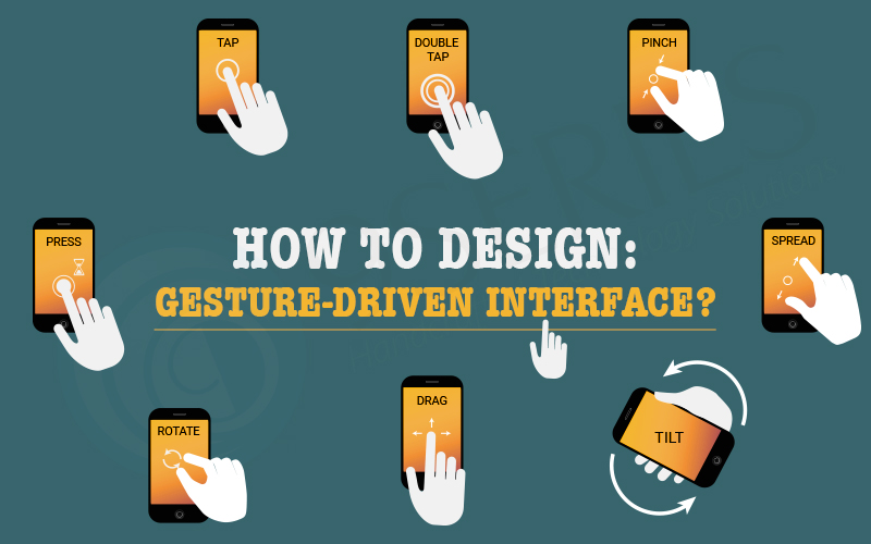
Common gestures include:
- Tap
- Swipe
- Pinch
- Long press
- Drag
While these gestures are powerful, they are often invisible. Unlike buttons or visible controls, gesture based interactions are hidden unless properly indicated. That makes discoverability one of the biggest challenges in gesture driven UI design.
How to Choose Useful Gestures
Before integrating gestures into your design, understand your target audience and the apps they commonly use.
Ask yourself:
- What gestures are users already familiar with?
- Are similar apps using certain swipe patterns?
- Will introducing a new gesture create confusion?
Using familiar gestures reduces learning friction. When you align your interaction patterns with user expectations, you create a smoother onboarding experience and minimize frustration.
The goal is not to innovate for the sake of innovation. The goal is to enhance usability.
The Challenge of Instructing Gestures
Gesture based interactions are powerful but invisible. Users cannot see a swipe or pinch the way they see a button. This means designers must carefully guide users toward discovery.
Unlike traditional graphical interfaces, gesture based controls require visual cues that suggest possible interactions.
Design for discovery by:
- Providing subtle visual hints
- Using motion to suggest direction
- Indicating interactive areas clearly
- Avoiding hidden critical actions
Without guidance, users may never attempt the gesture at all.
Avoid Overloading Users with Tutorials
Many apps rely on lengthy tutorials and walkthroughs to explain gestures. While tutorials are common, they are rarely the most elegant solution.
The problem with upfront tutorials is cognitive overload. For example, forcing users to read through a seven page introduction before using the app often leads to confusion or abandonment.
Users do not want to memorize instructions before taking action. They want to explore naturally.
Instead of overwhelming users with instructions, focus on contextual learning.
Teach Gestures in Context
The most effective way to teach gestures is within the moment of action.
Best practices include:
- Introduce gestures gradually
- Provide hints only when needed
- Use lightweight prompts
- Explain one interaction at a time
For example, if a user reaches the end of a scrollable screen, you can gently indicate that swiping sideways reveals more content.
Contextual guidance feels natural and does not interrupt the experience.
Using Animation to Communicate Gestures
Animation is one of the most powerful tools in gesture driven design. It communicates possibility, direction, and response.
Without animation, gestures lack feedback. With animation, interactions feel intuitive and alive.
Here are three effective techniques for educating users through motion:
- Animated Visual Hints
Animated hints create a relationship between gesture and result.
For example:
- A card slightly shifts sideways to suggest it can be swiped
- A button gently pulses to suggest interaction
- A panel partially slides into view
These subtle cues guide users without explicit instructions.
- Content Teasing
Content teasing is a subtle way to indicate additional content.
For instance:
- Showing part of the next card behind the current card
- Displaying partial images at screen edges
- Revealing a small portion of hidden content
This visually communicates that more exists beyond the current view and encourages swipe interaction.
- Affordance and Motion Feedback
Affordance refers to design elements that naturally suggest how they should be used.
You can:
- Use bounce effects to indicate scroll limits
- Add pulsing icons to suggest interactivity
- Provide fluid transitions between screens
A great example can be seen in the lock screen interaction of iOS, where sliding motion clearly reveals additional functionality.
Affordances reduce uncertainty and build user confidence.
Designing Beyond Flat Screens
Gesture driven interfaces require designers to think beyond static layouts. They must consider:
- Dimension
- Motion
- Timing
- Transition
- Feedback
Design is no longer just about color and typography. It is about creating an interactive flow that feels natural and responsive.
Touch interfaces are mostly invisible, but through thoughtful animation, contextual guidance, and subtle visual cues, designers can make gestures discoverable and intuitive.
Conclusion
Designing a gesture driven interface is about balancing innovation with usability. While gestures offer powerful interaction possibilities, they must be intuitive, discoverable, and supported by clear feedback.
The future of UI design lies in understanding how users naturally interact with devices and enhancing those interactions with thoughtful animation and contextual learning.
As UI and UX designers, we must continue exploring the full potential of touch based interfaces and think in terms of motion, depth, and time. When done right, gesture driven design transforms digital products into fluid, engaging, and delightful experiences.


