Remember the time when smaller mobile phones were fancy and had small screens?
Well that time has gone!
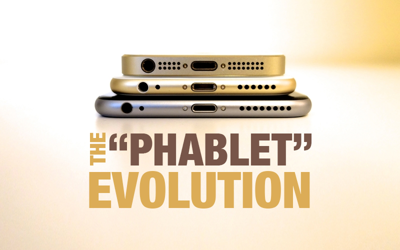
A smartphone with a screen size between a traditional phone and a tablet is commonly known as a phablet. The term itself combines two words: phone and tablet. These devices typically feature screen sizes ranging from 5 inches to 6.9 inches, offering users a larger display without fully transitioning into tablet territory.
Over the past decade, smartphone size, design, and user expectations have evolved dramatically. The introduction of the iPhone by Apple marked a turning point in mobile design, accelerating the shift toward larger screens and more immersive user experiences.
Today, phablets dominate a significant portion of the smartphone market. But what does this shift mean for UI and UX designers?
The Evolution of Smartphone Screen Sizes
Before 2007, mobile phone manufacturers like Nokia and Sony Ericsson gradually increased screen sizes from 1.7 inches to 2.6 inches. These increments were relatively small and conservative.
When Apple introduced the first iPhone with a 3.5 inch screen, it represented a dramatic leap in display size compared to its competitors.
The real disruption, however, came in 2011 when Samsung launched the Samsung Galaxy Note with a 5.3 inch screen. This device effectively introduced the phablet category and changed consumer expectations around mobile screen real estate.
By 2014, Apple entered the larger screen market with the iPhone 6 Plus at 5.5 inches. Samsung expanded its Note lineup with 5.7 inch displays, and Google followed with devices like the Pixel XL featuring 5.5 inch screens.
Today, screen sizes between 5.5 inches and 5.9 inches are often considered optimal for large screen smartphones.
What the Rise of Phablets Means for UI and UX Designers
The most significant impact of phablets is on user interaction, particularly in one handed usage.
A larger screen provides nearly double the interface space compared to older 3.5 inch smartphones. While tablets are designed for two handed use, phablets must balance both one handed and two handed interaction.
This introduces a critical UX concept known as the Thumb Zone.
Understanding the Thumb Zone
The Thumb Zone refers to the area of the screen that a user can comfortably reach with their thumb while holding the device in one hand.
On larger screens, top corners and upper navigation elements become difficult to access without adjusting grip. Poor placement of interactive elements can negatively affect usability and overall user satisfaction.
For phablet design, optimizing the Thumb Zone is essential.
Key Design Considerations for Large Mobile Screens
- Bottom Navigation for Better Reachability
Traditional navigation patterns placed menus, especially the hamburger icon, at the top left corner of the screen. While this worked on smaller devices, it becomes less practical on phablets.
Moving primary navigation to the bottom of the screen significantly improves accessibility. Frequently used actions should be positioned within easy thumb reach.
For example, if 20 percent of users in a large social app audience access the platform via phablets, poor navigation placement could impact thousands of users daily.
Bottom navigation enhances usability, reduces friction, and improves overall engagement.
- Floating Action Buttons for Clear Calls to Action
When designing for Android devices, system navigation elements often occupy space at the bottom of the screen. This can conflict with custom bottom navigation.
To address this, Android design guidelines recommend using Floating Action Buttons.
A floating action button:
- Highlights the primary action on a screen
- Stands out visually
- Guides user flow
- Reduces interface clutter
Proper placement of floating action buttons ensures that users can easily perform key actions without accidental taps.
- Responsive Design Patterns for Larger Screens
Responsive design must go beyond simply resizing images and text. On larger screens, poorly positioned buttons and navigation elements may become harder to reach.
For improved usability on phablets:
- Place important action buttons near the center or lower portion of the screen
- Align navigation elements centrally when menus expand
- Avoid placing critical actions in hard to reach corners
Designers should test layouts during the prototyping stage to ensure comfortable interaction across different screen sizes.
Bigger Screens, Smarter UI Decisions
Designing for phablets presents both challenges and opportunities. Larger screens provide more creative flexibility but require thoughtful UI adjustments to maintain usability.
Prototyping and usability testing become increasingly important when designing for large screen devices. Designers must focus on natural interaction patterns and avoid awkward thumb stretching.
Phablets have reshaped how users consume digital content. They demand smarter navigation patterns, intuitive layouts, and user centered interaction models.
Conclusion
The rise of phablets has fundamentally changed mobile UI and UX design. With screen sizes ranging from 5 inches to nearly 7 inches, designers must rethink navigation placement, thumb accessibility, and responsive layouts.
The real challenge for UI and UX designers is to enhance the advantages of larger screens while minimizing interaction discomfort. By focusing on thumb friendly design, bottom navigation, and clear calls to action, designers can create seamless experiences that fully leverage the potential of phablets.
Bigger screens create new possibilities. Smart design turns those possibilities into meaningful user experiences.


